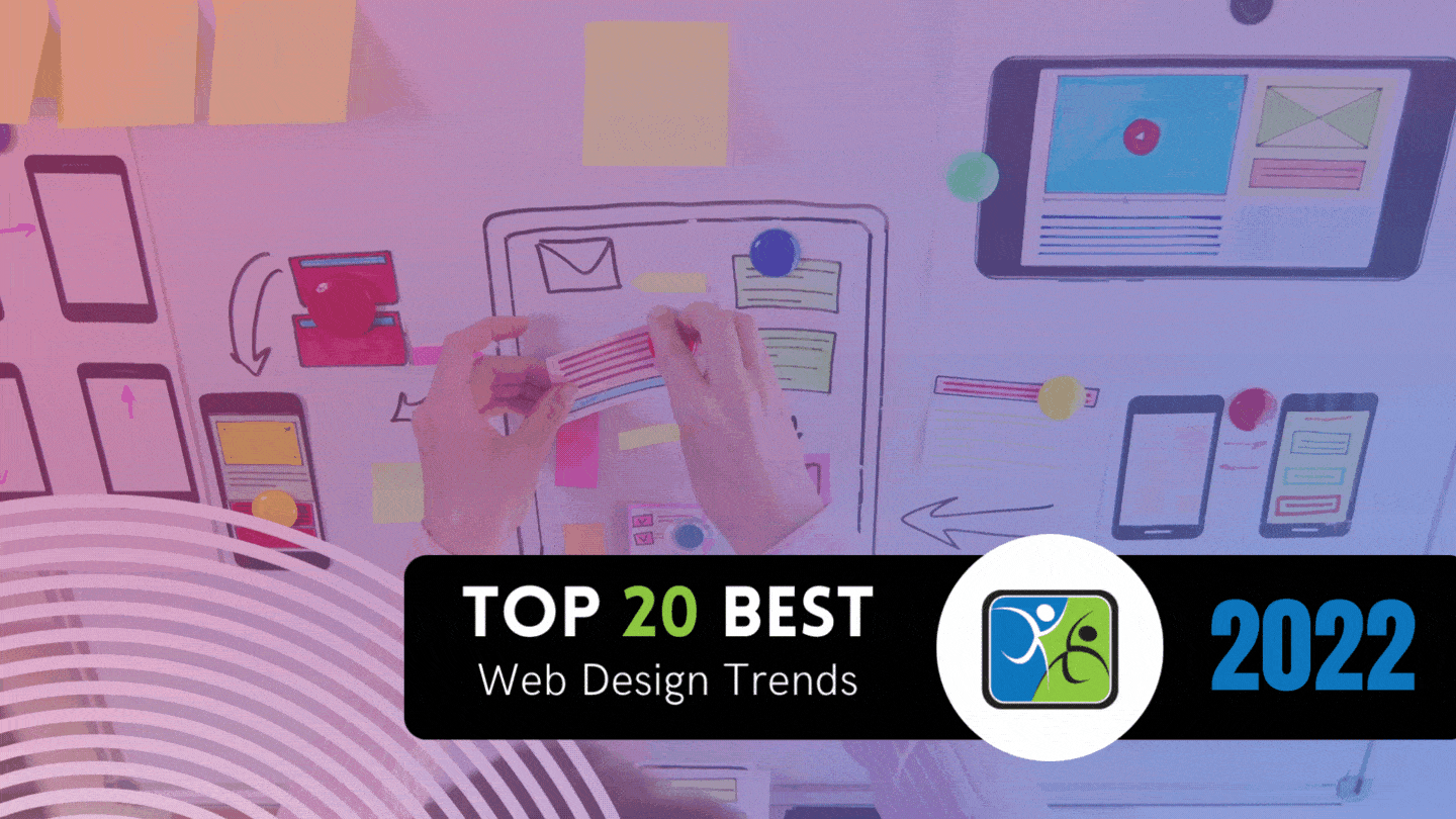
Web design is constantly evolving. From Web 1.0 to Web 3.0, we’ve seen some dramatic shifts in how the web works. The best web design today is, of course, hyper-mobile: It’s designed for the phone. But if you dig deeper into web design trends, you’ll also find some interesting visual elements.
1. Experimental Navigation
Designers have become confident enough in navigation that they are now playing around with the traditional navigation elements on a website, such as the menu bar. They might add new features or rearrange the order of the elements. Sometimes, they’ll even remove the navigation altogether, especially if they want the reader to focus on a single thing. Today, enough people are familiar with the traditional icons of navigation (such as “Home”) that they also don’t need to be labeled, freeing designers up to be a little more concise and creative with their iconography.
2. Scrolling Effects
Parallax remains king. But now, we’re seeing all sorts of other scrolling effects being used to engage the reader. On some sites, you’ll see elements that move faster or slower than the rest of the page. Others use animations that are triggered by your scroll position. It’s a great way to add some life to an otherwise static design. You can even just start flashing animations (sparingly) as the user scrolls down the page.
3. Kinetic Typography
This is a trend that’s been around for a while, but it’s still going strong. Kinetic typography is all about moving text and making it part of the design. Sometimes it’s used for animation, other times it’s used to create an interesting visual effect. Frequently the animations are dynamic and complex, reacting to (for instance) the user’s actions. There are CSS libraries and classes that will make headers, for instance, start to move as the user scrolls down the page.
4. Drag Interaction
This trend is all about making the user part of the design. By allowing them to drag elements around, or even just move their mouse, they can interact with the design and see how it changes. This is a great way to add an element of fun and playfulness to a design. But do plan for the fact that some people will be on a laptop and others may be on a mobile device like a phone.
5. Retro Typography
This trend is a throwback to the early days of the web, when designers were just starting to experiment with typefaces. Today, we’re seeing a resurgence of these retro fonts, often used in combination with other vintage elements like distressed textures and muted colors. It’s a great way to add some personality to a design.
6. Cinemagraphs
A cinemagraph is a still image that has one element that moves. It’s a great way to add some life to an otherwise static image, and it can be used to great effect in web design. Often, the moving element is subtle, like a person walking or leaves rustling in the wind.
7. Brutalism
Brutalism is a trend that’s been gaining popularity in the design world, and it’s starting to make its way into web design. Characterized by its raw, unrefined aesthetic, brutalist designs are often heavily textured and use rough-hewn elements. This trend is all about embracing the imperfections of the art, which is an interesting contrast to the often disconcerting “perfection” of Web 2.0.
8. Monochromatic Gradients
Gradients are back in a big way. And this time, they’re monochromatic. Rather than using multiple colors, these gradients use different shades of the same color. They can be used to create a wide range of effects, from subtle textures to eye-catching images. This adds complexity without visual confusion.
9. Layering
Layering is a trend that’s been gaining popularity in the design world, and it’s starting to make its way into web design. By combining multiple images, typefaces, and colors, designers are creating complex designs that are full of depth and interest.
10. Text-Only
Another throwback to the early days of the web. Today, we’re seeing a resurgence of these text-only designs, often used in combination with other vintage elements like distressed textures and muted colors.
11. Animated Illustration
Animated illustrations make the web “fun” again. They’re used to create playful, human designs rather than designing around a robotic structure.
12. Ultra-minimalism
Designers are stripping away everything that isn’t absolutely essential. This results in designs that are incredibly clean, efficient, and easy to use. Incorporate bright colors to develop some personality in an ultra-minimalist spread.
13. Mixing Horizontal and Vertical Text
By mixing horizontal and vertical text, designers can create interesting visual effects while engaging the audience. The text becomes a sort of “puzzle” that the designer may need to figure out.
14. Geometric Shapes and Patterns
Geometric shapes and patterns are a great way to add interest and visual appeal to a design. They can be used to create a wide range of effects, from subtle textures to eye-catching images. Make it either the background or the focus of your next design; they’re also very easy to make and easy to animate.
15. Thin Serif Fonts
Serif fonts have been making a comeback in the design world, and they’re starting to make their way into web design. These thin, elegant fonts are perfect for adding a touch of class to a design. Traditionally, they weren’t used because they were harder to read. But on high-resolution screens, they lend everything a sort of “old world” vibe.
16. Overlapping Text and Images
For a long time, this was avoided. In fact, it was just difficult to do in the early web. But now, dynamic programming and markup can overlap text and images in a way that’s engaging rather than visually confusing. When done correctly, this look is advanced, clean, and readable. When done incorrectly, it can appear to be amateurish.
17. Broken Grids
The traditional grid system is a thing of the past. Designers are breaking out of the box and creating their most unique layouts. This allows them to create designs that are more fluid and organic, which can be very visually appealing. But it also means they have to work a little harder when developing their designs, as most of them today are on a grid-based infrastructure like Bootstrap.
18. Organic Shapes
Organic shapes are another way to add engagement after a long period of straight lines and generic copy. Use organic shapes to add interest to otherwise straightforward designs; just a few curves will improve the “fun” quotient aspect while also making the design a little easier on the eyes. Organic shapes are the direct opposite of the “brutalism” tactic, but it can also be mixed to create something that’s complex, unique, and interesting.
19. Web Textures
Just be careful not to go overboard, as too many textures can make a design look cluttered and busy. Web textures are sort of the evolution of grid lines and organic layouts, adding visual interest without necessarily adding another element that an individual has to pay attention to. When designing a website, try to isolate two or three major elements (which can also be colors) and avoid adding any more.
20. Grid Lines
Grid lines help to keep everything in its place, but they can also be used to create interesting visual effects. By playing with the spacing and alignment of grid lines, designers can create a wide range of looks, from subtle textures to bold images. And because grid lines are so easy to work with, they’re perfect for designers who want to experiment.
The Basic Design Trends of 2022
The web is getting a little more playful and fun. Designers are breaking out of the box and creating their most unique layouts. This allows them to create designs that are more fluid and organic, which can be very visually appealing. But it also means they have to work a little harder when developing their designs, as most of them today are on a grid-based infrastructure. If you’re creating a generic corporate site, consider adding a few playful elements to humanize your brand. If you’re designing a site that is naturally playful and fun, consider using a grid-based infrastructure or mesh to rein it in. It’s all about balance.
More than anything, always remember that people are interacting on the web. They are swiping and pinching. They are tapping rather than clicking. This is something that we are going to see much more of moving forward and a critical design trend that can’t be ignored.
Apart from the above, don’t forget that the web needs to remain accessible. The best web design will be useable for screen readers, too. Contact us today if you want to learn more about Denver website design.